Automation Design
While at Avidon Health in 2023 I worked directly with the head of product and CTO to design an upgraded automation platform. You can read all about it here, and view a demo. The main video on the homepage includes a product tour.
Minimally Invasive Surgical Robots
Developed the onboarding visuals for an embedded system UI. The goal of this experience was to guide the surgical techs in the assembly of the robot.

Worked directly with the human factors engineering team to determine which cues would be visual, haptic, auditory, or a combination. For example, a tech installing the instrument arm would be notified of a successful installation by the click into place they feel, the sound they hear, the little green LED on the machine itself, and the UI notification on the screen I was designing. Four levels of user interaction to ensure this process is correctly performed.

The rest of the process in exported pdf format.
Physician Portal – Care 4 Today
This is the interface that the physicians will be viewing about their patients data. The consumer facing app gathers data from patients from various channels and visualizes the results on a clinical dashboard.
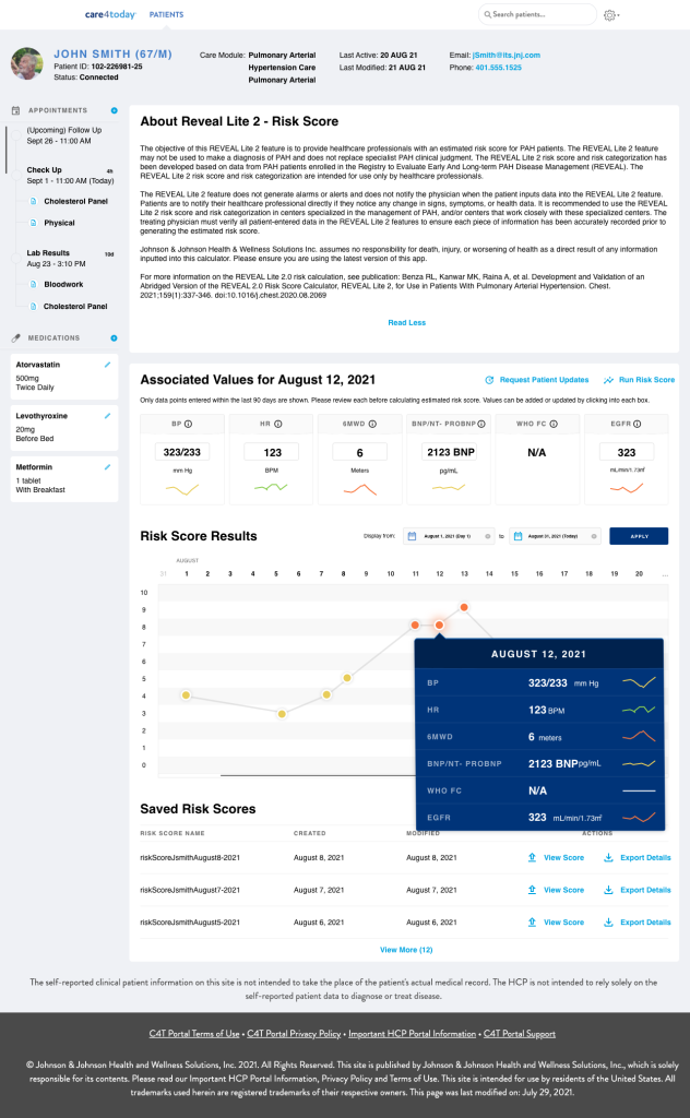
A team of subject matter experts from the business worked with me to create the requirements of the dashboard, ensuring its clinical relevancy. The info icons were used to convey important and sometimes required pieces of information.

Some other screenshots of the early versions of the product designs.

User Research – Janssen Oncology
Research from the discovery phase of an engagement with the pharmaceutical arm of Johnson & Johnson. This research went on to inform design decisions regarding the product positioning and brand migration from Janssen Care Path to Janssen Compass. Remarks seen in the report are from UserZoom participants went on to inform the design decisions of our wire frames.
Exported PDF of the results.
Open Source Radioloogy Platform Redesign – XNAT.org
From January to August I guided the redesign of XNAT. What’s XNAT? From the meta data pulled on Google: XNAT is an extensible open-source imaging informatics software platform dedicated to imaging-based research. It’s essentially a platform for radiologists and researchers to work on.

Working in healthIT for this long and still surprised. I thought it was a cool little piece of open source software, myself. Improving outcomes and facilitating research and progress all while maintaining a free access model. It was an attractive product in every aspect, so when the time came in the new year (this was January 2023 when it began) to begin a new project this was an easy choice.
XNAT 2.0
That’s what what we started calling it. I didn’t really spend too much time on branding, just needed something to put in the top left as a temporary place holder for a logo to come. It was a big deal to the community to try and redesign an open source product that had evolved so independently of every iteration before it. You could just write a module, contribute it back to the XNAT world and that’s how it went. Each piece functioned independently of everything else which meant for a difficult experience for users.
The goal of this engagement was to redesign the front end of the software. This meant a discovery phase, lots of interviews and research. Working directly with some of the original authors of the platform itself and some of the most impressive engineering teams I’ve ever seen, we were able to define scenarios, the users in them, and create a figma prototype around specified objectives for our users.
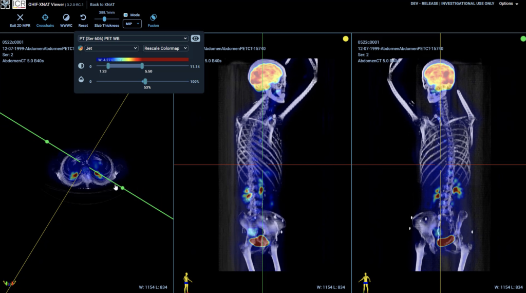
Home
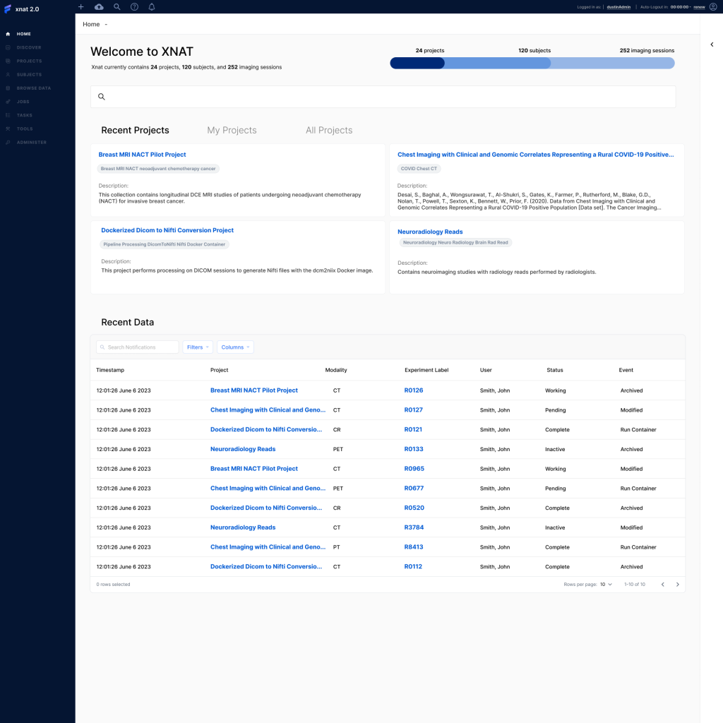
Let’s get to it – As is the case in most product design situations you have an established design system that needs to be followed. Working in rapid production environments requires you to utilize the existing components of visual libraries, that way you can stand up these high fidelity, production ready deliverables quickly. There was a lot of list building, sharing, task creation and delegation but it all took place in the viewer.
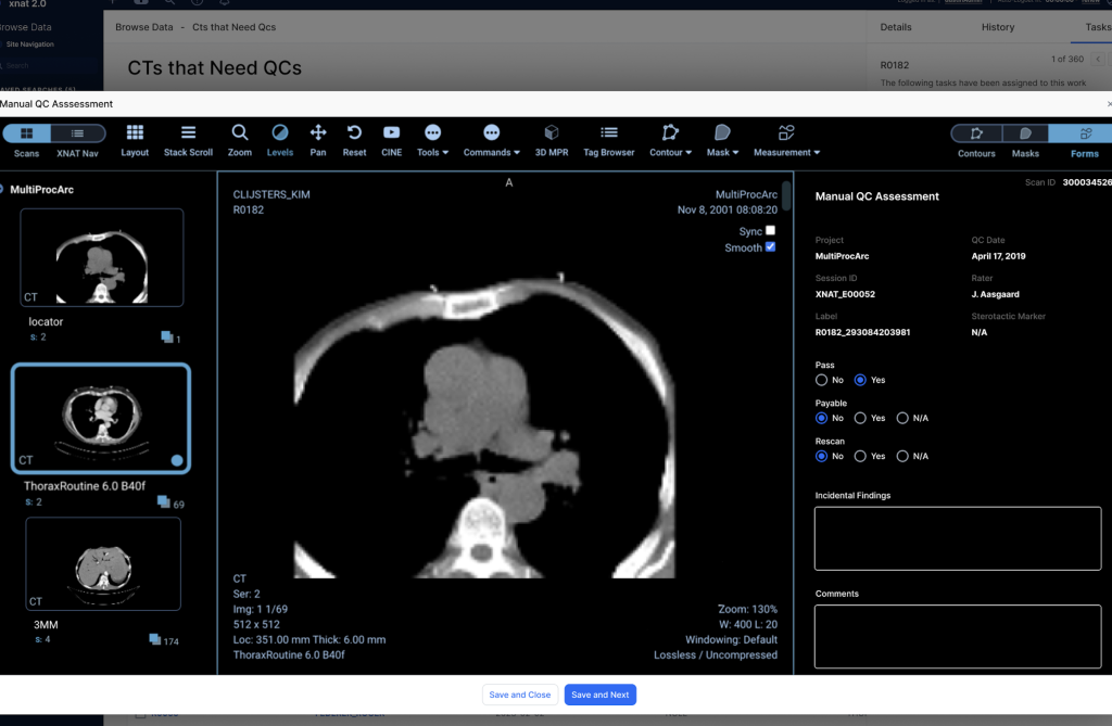
This is a screenshot from one of the prototypes, you can see behind the modal the user is looking at a list that says “CTs that Need QCs”. It’s a user created name for a “Saved Search” that been filtered and joined to other lists to finally produce one list that the user wanted to save its parameters. Inside the viewer itself, to perform the Quality Control

They are looking at the image and using their training/background to determine if the scan is usable. Meaning if it’s not cut off somewhere, a blinding light in the middle, (crazy things can happen in the output of the machines). What can also happen is, there can be burned in pixel data specifically around PHI (personal health information). The key to this research platform is protecting patient data and that means anonymity. If the persons name or any other identifying data is present in the image it has to be De-Identified (edited to cover it up or remove the pixels all together)
Task delegation/list sharing
After the user does as many as they can, often theres a team of people working on this because of the sheer amount of data being generated from hospital PACS. They’re helped with scripts and algorithms but there still needs to be some sort of final stamp of approval before being distributed for research.
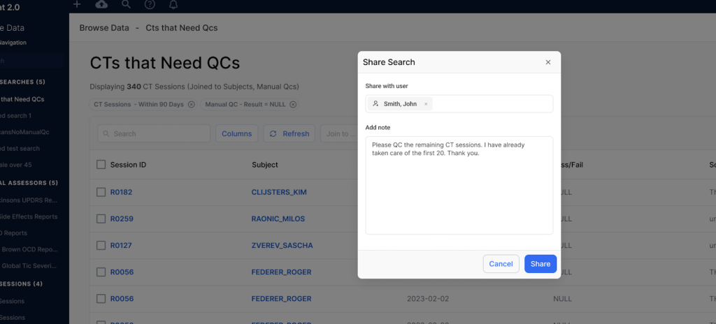
Here’s an example of a radiologist finishing 20 Quality Control checks and asking a peer to take a look at the remaining on his work list. The mechanism of task delegation/creation was something added to the experience to create a sense of cohesion in the workflow.
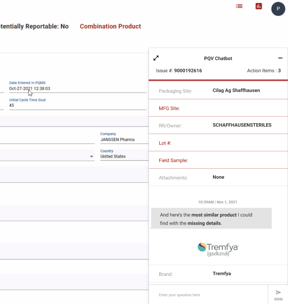
PQMS Chatbot
During product complaint intake and processing, there are missing or incomplete data sets. Currently, it’s difficult searching for these required missing fields.
The chatbot surfaces issues for easy fixing.
The full report is here and the clickable prototype demonstrating the proposed solutions.
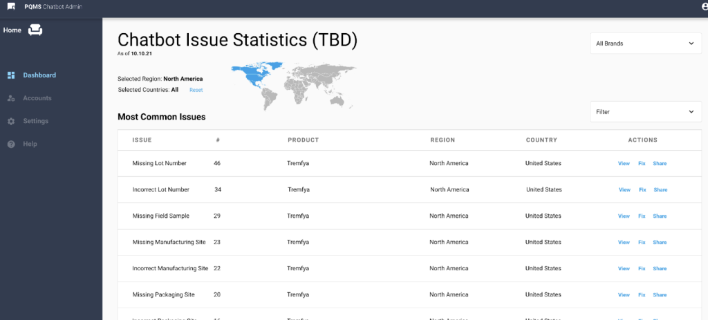
We designed in a reporting dashboard so analysts could see which products were being reported the most and for what defect.
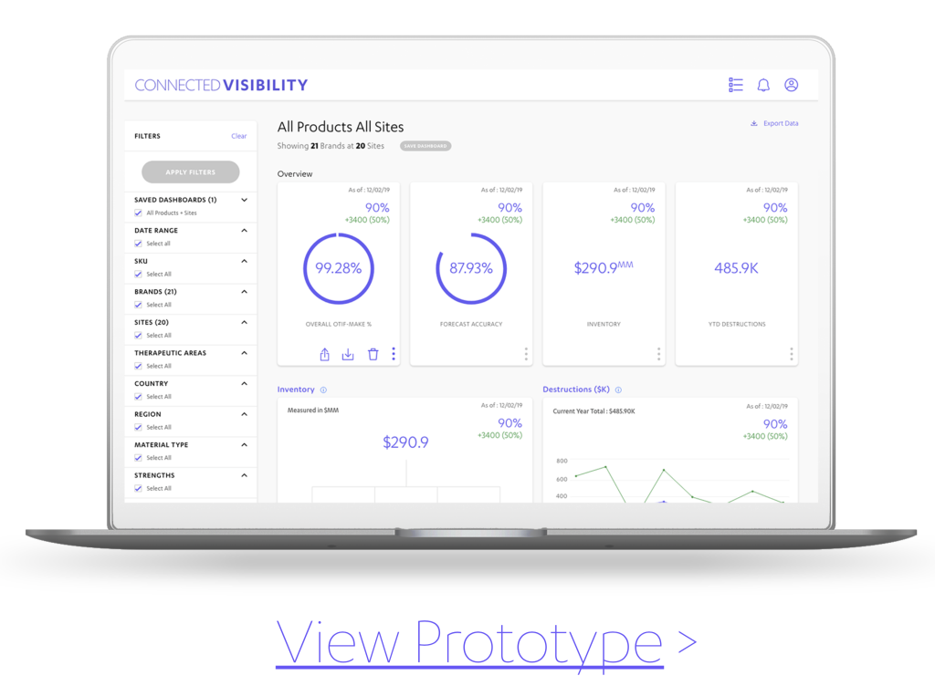
Connected Visibility
Connected Visibility was the given name to a product that the supply chain analysts at Janssen Pharmaceuticals use each day. We created a set of usability tests identifying the unmet needs possible enhancements.